FINAL MAJOR PROJECT
The Final Major Project or FMP is the last unit in the foundation course, it gives us a chance to bring together all the skills we have learned to create a piece of self directed work on whatever we wish.
DATES
22/02/19
Proposal, time plan and bibliography
07/05/19
Hand in
22/05/19
Show
OBJECTIVES
To enable the candidate to take responsibility for their own learning by demonstrating their achievement in proposing and realising a project which integrates contextual perspective, research, problem solving, planning and organisation, evaluation and reflection, and practical, technical and presentational skills
what are my interests?
Cycling, Coffee, Food, Art, Traveling, Music, Garms, Depop, Photography, Cooking
CYCLING
When started the foundation i sold my car and brought myself a bike. Since then I have cycled every day to university and also cycled everywhere else. Therefore I thought it would be fitting to do my final major project on cycling as it has changed my life. I have decided to go with my bike idea as I think it's a very strong project with lots of scope for ten weeks. I feel like I will be able to explore many different avenues with this project and I will also be able to learn lots myself.
Friday 15th February
Proposal
Project Title: Make Cycling Clothes Trendy
Review Progress and Achievement (approx. 150 words)
The Foundation course at AUB is the best thing I could have done when coming from foundation. I started the academic year believing that I would continue onto Photography or Film however after having a workshop in how graphic design can help photography in advertising I realised I’m much more interested in typography and layout. After choosing my graphic design we did workshops in Photoshop, Illustrator and After effects. I really think this pushed my work forward as this knowledge was completely new and without choosing graphics I don’t think I would have learnt as much as I have done. In the future I hope to go on to study Graphic Design at degree level and already have a place at UAL Camberwell for this. In the distant future after my degree I want to go on to work freelance or for a company as a graphic designer and work up to hopefully one day be a creative director of a company.
Project Concept (approx. 250 words)
I don’t believe that enough people ride bikes in Bournemouth. I want to create a piece of work inspired by trying to get more people on bikes. I started cycling when I tried to drive to university on the first day and turned up an hour late. I brought a bike the next day and have cycled every single day since. Over that time, I have learnt lots about cycling and have broken/ fixed lots of bikes. I few weeks ago I realised that I didn’t need a car anymore and sold it to buy another bike. After a while you start to get more confident when you cycle and end up going further then you would have when you started, this I found took time but I eventually found that wherever you need to go around Bournemouth you can do by bike. I’m proposing a campaign for the council to try and influence more adults commuting to work to do so by bike. This will be backed by studies into issues surrounding health and fitness also global warming. I will do this by pulling skills that I have learned throughout my time on the graphic design course. This will provide real world and contextual relevance to my project by looking at how I could influence my local community linking behavioural change and nudge theory. I will do this by pulling skills that I have learned throughout my time on the graphic design pathway and using the resources such as the print rooms and the laze cutters to create my body of work.
Evaluation (approx. 100 words)
Evaluation during this project will be a key part of making it successfully. I aim to right weekly reflections alongside a middle stage reflection alongside an end of stage reflection. I believe doing this will help me not get stuck when I’m doing my project. I feel like as I have done this all through my time on the foundation I will be able to keep it up when I am doing my final major project.
weekly reflection 01
I have started my weekly reflections a week early and for a good reason. During the week leading up to the start of our Final Major Project we have had to start to brainstorm different ideas for what we could possibly do and create a presentation that explains two different ideas that we have. I have started to brainstorm however I am finding it difficult to come up with ideas, I think this is because the idea of having free reign with a project whilst it seems quite nice its actually quite a daunting task. We also have to create a time plan and start a bibliography which are all coming along quite nicely. Overall this week has been good as I felt relieved to have passed stage two and can’t wait to get on and start my Final Major Project.
Monday 25th February
Today we pitched our ideas for our final major project. I decided to pitch my cycling idea as I think it has a lot more movement that the other one and will keep me interested for much longer.
intensions
To create a body of work with the emphasis on why cycling is important for future generations.
research
Allycat Races, Contemporary, Issues, Commuting, Fixed Gear, Maintenance, Food Prep, Cookbook, Messenger/ Courier Lifestyle, Dustin Klein – Cadence, Time’s Up, Icarus Fixed, FOAD Gang
Time plan
I have created a time plan for my final major project, this will allow me to keep track of what I have done and this will motivate me forward. It will also allow me to reflect upon what i have already looked at and see if I have any gaps in my work.


moodboards
I have made mood boards with the outstanding theme of cycling. I made these on Pinterest as here I can find lots of different themes and put them together all in one place. These are what interest me within cycling and are relatively narrow, however its good to see so that I am able to branch out into other things.


Mindmap
I created a mind map with the theme of cycling at the centre, I tried to explore all the different aspects within cycling however as I go along i will add to to this to make sure i haven't missed anything.

weekly reflection 02
This week we presented our ideas for our Final Major Projects, I presented my idea of trying to get more adults that commute to work in a car to do it by bike. This is an important issue to me as the amount that pollution cars use is huge. I feel as thought if we are able to combat this by getting people to cycle to work we could definitely reduce our use of undeniable energy. I also have deep connections with cycling as I have have cycled to uni day and sold my car as a result of realising I don’t need it.
why ride a bike?
There are many reasons why one might ride a bike, too the uneducated it would be because they cannot afford a car however I want to again try and challenge this stereotype in the work that I produce as I really do think there are an endless amount of reasons why people ride bikes. The bike is humble, it does not cry out for attention, it will keep you fit and healthy and you are also doing your bit for the planet too keep your carbon footprint down.
Tuesday 26th February
Ted Talks
I started off my research by looking at some Ted talks on cycling, these gave me different opinions on why you would cycle and also why different people cycle. I also researched why some people do and don't cycle. This will also help when trying to influence more people to cycle as I will know the reasons why they don't.
In this video, he talks about how the humble bicycle has changed his life when he fell ill. He goes to great lengths to outline the importance that the bicycle can bring to your everyday lives and shows the health, economical and everyday factors that really make cycling great.
This video on the contrast, is around why you would cycle in somewhere where everyone else drives a car. This is so important in our todays society as Globally, about 15 percent of manmade carbon dioxide comes from cars, trucks, airplanes, ships and other vehicles. Because of this, the bike is important because it doesn't contribute to any greenhouse gasses and consequently to global warming.
CYCLE TO WORK SCHEME
The cycle to work scheme is a government implemented scheme to try and get more people to ride a bike to work. They are doing this by offering you anything bike related up to £1000 tax free. This important because you might see a bike as something overpriced and this could help you decided if or you want to purchase one.
.jpg)
is it still relevant?
As the cycle to work scheme has elements where is defiantly still relevant, however i don't think it is as important as it used to be. This because of the lack of publicity it has had. I think that if the government really pushed this idea with TV and radio campaigns a lot more people would have been made aware and subsequently joined the cause. This also could have been done with a good graphic design campaign because then it would have reached a wider audience. Overall i think it is still important today but it is less relevant because the people who cycle to work have been cycling to work for a long time.
weekly reflection 03
During the first week of our Final Major Project I started by looking at lots of different research and how that could effect my work going forward, this has been very beneficial as I now how a good starting point from where I can develop my work in the future, I also have actually really enjoyed the research that I did. I looked into my demographic, colour theory, logos. I also started to design my own logo to get the idea of branding started. This is important because otherwise it could be difficult to have a solid foundation for where my branding starts.
Monday 11th March
Today I had my Stage three tutorial, this gave me a chance to sit down and talk through my project and explain how far along I am. After sitting and talking for some time it was clear that my project is lacking research and this is preventing me from moving on towards the next stage of developing my work further.

Review Notes
Understands the assessment process
Final Project, look book for a range of cycling clothing
Research look books for different fashion brands
Context, Layouts, grids, bookbinding, colour theory
Drawings for look book
Interview people as part of your primary research
Experiment with the design and use drawing skills
action plan
After having my tutorial i realised i need to make an action plan to make sure that I'm going forward in the right direction. I also feel more focused on my project and how it can be moved in the right way.
THURSDAY 14TH MARCH
LOGO DESIGN 01
As a part of my branding idea, i decided to get the ball rolling by creating a logo for my social media presents. I had a few different ideas from where i could take this when i started doing it however i wanted to make sure it fit my target market. Because of this I am going to be sure to use muted colours and come across serious. This will be reflected in the typeface and the colour scheme.
COLOur THEORY
I started designing my logo by looking at colour theory, i feel as though this is always helpful because you really need to look at the demographic you are advertising too to be able to choose the a colour fitting for the company too.


This is the colour palate that I have chosen, I have been looking at these because they fit my demographic as I want my branding to feel more adult and sophisticated.
Type Tests
Getting the right typeface for your brand is really important. This is also especially important when creating a logo with text in it. This is because you want something instantly recognisable, and to also fit your demographic. This is why I am going to do type tests to find the right typeface that will fit with my branding.


I have chosen Gotham Black as the main typeface for my logo, I think this is the best typeface for my branding because as of it being smart and adult. I also think its a clean and because of this it will fit my demographic well.


These are websites whereby you are able to get free fonts so you are able to carry out type tests with a much larger range or different fonts. Over time I have collected lots of different fonts to play around with and this has defiantly helped with looking at type tests.


I started my logo by looking at colour theory, type tests and I then moved on to creating some drawings of some wheels. These where done in Adobe Illustrator. I had to learn the process of making these wheels with Illustrator because i was so used too using photoshop, yet illustrator will be better for my branding for the future.
Best Illustration

I feel as though this is the most realistic of the wheel that i have designed, i created this by using lots of different layers. I feel at the the scale and colour are right, this makes for a good drawing.
Creative Proces
I wanted to outline my creative process, I feel this is important as it shows my workflow when creating logos. Here I have gone through and made my logo on illustrator creating my my wheels on different art boards and then using them in my logo. I feel as though this is the best way to work as I am able to create lots of different work very quickly, with different variations on each


Final Logo
I thought it necessary to take a look at my initial logo outside the confines of adobe illustrator, I think this is important because you get a much clearer view around what the logo would look like outside of illustrator. I will be reviewing my work and have now decided to go back and create another logo to represent my brand. I also feel as though this logo doesn't have enough going on, and for this reason I am going to make the wheel move on the logo.

after Effects 01
This is the first video that i created on after effects, i used the rotate tool with my illustration of a bike wheel to make it look as though it is moving, I think that it really works, however there are some things that i have noticed that I really do not like, the fact that the quality is terrible is an issue is something that needs sorting.


Here I have changed my video from the last one by making sure that I am creating my art on the relevant art board, in this case it was specific for film/ video and this is what made sure the quality is better than the previous video.
Final Video 01
Overall this is what I have made from looking into after effects for the short amount of time that I have looked into it with my first logo. I have really enjoyed using this program and will defiantly be using it as we go forward. I feel as though my branding needs something to stand out against its rivals, and I defiantly feel as though animating it is a good way to go.
weekly reflection 04
After creating lots of different logos, I then had a change of heart with my idea. After doing a survey of why people do/ don’t cycle, it became clear that a lot of people don’t cycle to work or school because they are embarrassed by how they would look. This is a combination of cheap cycling clothing looking unflattering. Therefor I have decided to create a brand/ branding for my own cycle-wear company. This would be a contemporary approach to a problem that needs solving. My branding will be minimalist and clean and will still aim to get commuters on bikes, after doing this I spoke to some more people about my idea and they were all positive about it and gave me some good ideas where to go next. I definitely feel as though this week has been a week where I have focused down my ideas and this has made sure my project is going in the right direction.
MONDAY 25TH MARCH
Mid project critique
At the start of this week we had our mid-point critique for our final major project. This has given me some insight of how people feel about my work and what I should do as a result. Throughout my final major project my project has changed from being a government implemented scheme to get more people on bikes to being my own branding for a fashion company I have created. I was able to gets some feedback on my name for the company and this is the first thing that I am going to work on because I think it will bring the branding together.
I felt it really beneficial to be able to present my work because I was able to find my weak/ strong point myself through just talking through my idea with the group. I feel as though I need to go back and do some more research into brands that do a similar thing to me or even have a similar demographic. I think this will be important because otherwise I could make something that has already been made.
When thinking of my next steps, I feel as though I’m going to move into doing some illustrations of some shopfronts. I’m also going to design some garments that will be sold in my shop. Before this though I really need to do some research into different brands.

Tuesday 26TH MARCH
Branding research
As some research for my branding for cycle wear, i decided it would be a good idea too look into some companies that already make cool cycle clothes and are also kind of appealing to my demographic. I found four brands that were interesting for different reasons and i will look into the accordingly. These brands are different from other brands in the industry as they are quite high quality and desirable brands with a very trendy and cool demographic.
weekly reflection 05
Now that I have changed my idea, I quickly realised after having a mid-point critique that I really need to do some research into other brands that are selling things to the same market that I would be trying to as well. This is what I spent my time doing this week as I really feel it is important because otherwise I might already be making something for the same demographic that has been previously made. This week has been good because I now have a clearer view of what to do going forward in my branding of my own mock company, however I am also going to try to get out into the real world and see what cyclist wear on a daily basis to compare this with my work.
CADENCE
Cadence collection is a collection of work created by artist Dustin Klein in 2003. This collection prides itself on being the first lifestyle brand that also is linked to cycling. Over 16 years he has created his brand that has stemmed from messenger culture.

When doing research into the brand, there website is offline, this is because the creator has stoped making thins for Cadence and started making things for Chrome.

These are the last few pieces available for purchase on Dustin Kliens website, his contribution to the brand has been extremely important and the adoption of messenger culture is clearly visible.


RApha
The company was started in London in early 2004 by Simon Mottram and Luke Scheybeler; the first products were launched in July of that year. The name Rapha was taken from the 1960s cycling team Rapha, which was named after the apéritif drink company Saint Raphaël


Rapha has the same demographic as the company I'm trying to brand, however it is clearly a brand for cycling enthusiasts and my branding would differ from this as it would be for the average person.


Chrome
Chrome Industries designs, manufactures and sells messenger bags, backpacks, cycling apparel and footwear. Chrome Industries was founded in1995. Chrome Industries' headquarters is located in Portland, Oregon, USA 97209.


Weekly Reflection 06
TuesDAY 26TH MARCH
LOGO DESIGN 02
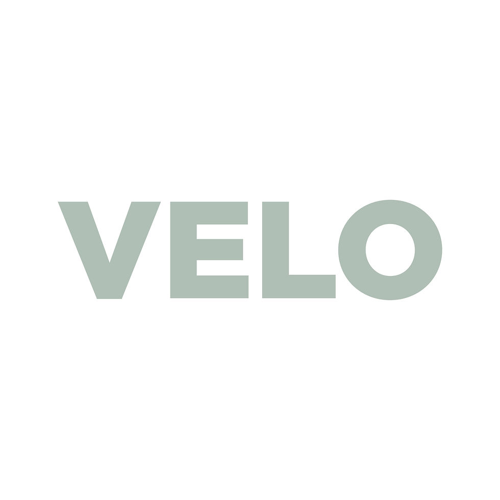
After doing the necessary research in order to more forward, I have now started on created another logo showing my brand identity. This logo is much cleaner than the last logo I have made, I have used “Velo” as that name for my branding as its much more minimal but still keeps the cycling influences. I have looked into color theory again and chosen a color that would fit with my demographic. I have had to look at complementing typefaces with this logo and have had to try and work around this to create my logo.
After looking at other brands who are like the brand that i am trying to create I now have a deeper understanding of how i can made/ develop my products to fit within the cycling market that already exists. This is really important because i now know what type of brand I am and what type of clothes I am going to make in the future.


This was my developed logo that I was sure of, until i had another talk with Seb about how it would look when it is scaled down smaller/ bigger. This is important for the branding of my mock company as i need the logo to be recognisable and to scale well. There for I went back and made it more simple.

Again I looked at some different colour tests to make sure that i was exploring ever possible avenue available to me. I wanted to make sure that I am creating something that will be able to stand the test of time and i really think this slate blue is perfect as it is quite classical in its own nature.


At this point I thought that it would be a good idea to remind myself of my original colour scheme that i implicated and too see how this had changed

I ended up going for the slate blue colour because of its classical characteristics, the colour was really important to me because of how simple my actual logo is it's self, i felt as though i had to get the colour right. These are all the colour test I did to find the right colour for my logo.

Overall I am very pleased with how my logo has turned out. I think its greatest strength is its simplicity and because of this can see it on garments and being made into badges/ patches in the future. Im also pleased with the colour and I really feel as though it fits with my demographic.
Weekly Reflection 07
Wednesday 27TH MARCH
After I created my logos, I then looked at some CAD drawings from Pinterest and the WGNC website that we have access’s to as part of AUB. These turned into the foundations for a lot of my different sketches and clothing drawings. I used these as I am not the best artist as I wanted to be able to make some quick designs without spending the whole time drawing them out on Illustrator. I really liked looking at these because it provided me with a really strong starting point for my clothing brand/ designs to move forward with and I really like the WGNC website as it gives you lots of interesting things like trend forecasting and a place to play around with color swatches.
clothing Illustrations
After carefully considering my brand research and logo I'm now moving onto starting to design my own clothes. This will be important for my brand as it is the end of use context. This brings a purpose to my work and fills other gaps where i would have fallen down before. Before I start designing my clothes I need to set out some brand guide lines, this will be incredibly important as otherwise my branding could fall down further down the road.


I started this they way I normally start research, by making a pinterest board, this is where I'm able to get a collective of lots of different images from many different sources too look at the theme that I'm exploring, in this case, it was technical line drawings of clothing. After doing some quick research into I now know as technical drawings, i decided to have a go myself. I did this again on illustrator, and I am really happy with the results. For my clothing brand I'm going to design a jacket, top and some trousers, i wanted too keep it simple because I don't want to create more than i am able to do professionally.
I have looked at many different tops in my research into cycling clothing, and the long sleeve stands out as the best choice for all weather riding. This is because of a lot of different factors including weather and usability, and i really feel as though you would be able to use this on a daily basis.
Front

For an initial drawing I am very pleased at how it has come out, again I used adobe illustrator to draw this with help from some technical drawing inspiration i have found on Pinterest.
Back

I have also drawn some trousers to go with my top, these have been designed specifically for cycling as they will be lightweight and breathable, yet they will also be suitable for any smart/ casual occasion. This means that they will be good for cyclist in work
Front

Back

Overall I really like my Illustrations that I have done. I feel as though they reflect what I have been trying to with the idea of trying to fuse cycle wear with casual office clothes, and I defiantly feel positive going into my final ideas with this and am going to move forward with this. Moving forward i am going to print these templates out and create different designs looking at what i like and what would fit with my branding.
Weekly Reflection 08
This week I have moved on from research and looking at Cad drawings to creating my own drawings of clothing and my own designs on which I am working towards. Again, I have looked at color theory and different designs and what would fit my brand best. I feel as though I have been sticking to my time plan well and have also been getting along well with everything else. Next week I’m going to start looking at ways to present my final piece for the show and look at context.
clothing designs
After creating my template designs, i have been experimenting with different designs. I thought this best to print them out as a starting point so i am able to work into them physically and break free from inside my laptop. It also will allows me to easily edit what I like back onto my original design and this in turn speeds up my workflow.


Best design
I really like this design and am going to take it off the paper and back into my laptop to create some different drawings from. I feel as though this design doesn't have to many connotations with cycling and would be perfect for my demographic as a result.
Weekly Reflection 09
I have now finished my T – shirt designs looking at different designs and color theory, I have now moved on to creating different design ideas for my final piece. I have really struggled coming up with how to present my work. However, after a lot of different ideas I think I am going to go with the idea of creating a webpage. This will present my work as I would like it to be sold and will also provide some end user context as well.
Colour Theory
Before taking my sketches into illustrator, I wanted to have a colour pallet in mind so that when I come around to using colour in my designs I am able to do so with ease. I went around doing this by just looking at the different Pantone colour books looking at different shades and how they interact, this did take a long time but I really feel it needed to be done.


Illustrator
After looking at colour theory, I then put my initial drawings into illustrator where I used them as a template to draw round them to create my wire frame drawing that I will then use as the foundation for everything i make in the future. The next step from creating this wire frame drawing is too now start playing with colour and see what they look like

Colour Studies
Here i have looked at incorporating my colour theory with my wire drawing to create four different t - shirts. I really feel these turned out really well and am really happy with they way they have turned out.


I am really pleased with how these have turned out, I am going to take these specifically forward into my final piece, with the idea of creating a webpage design.
Weekly Reflection 10
After finally choosing my format for my final piece, this week I sat down to design my webpage and how I am going to present my work. This will be done over two A2 pages one where I have a webpage showing my one T – shirt and all the information surrounding it, and another page whereby it exhibits all the available color schemes. I have really enjoyed doing this and really think my project reflects all what I have set out to do in my brief. Overall even though I have struggled with lots during this project I really do feel proud at how it has turned out.
Webpage Design 01
Here i have looked at incorporating my colour theory with my wire drawing to create four different t - shirts. I really feel these turned out really well and am really happy with they way they have turned out. and cant wait too use them in my webpage designing. I started off by looking at some videos on layout and these helped me as it gave me a much better understanding of how is hold lay out my own webpage and supporting pages.
Illustrator
This is my workflow throughout designing both my webpage and the supporting work. I thought it would be important to include this as otherwise you are unable to see any of my background work. My illustrator skills really have come along way from the start of the course and I really am happy with everything I have done in the graphic design pathway.


Final Piece 01
This is the first piece of work that I am going to submit as part of my final piece. It will be printed out and mounted on A2 and really reflects my brand and its identity. I have really enjoyed sketching, designing and making all these images and webpages and i feel as though i have learned so much as a result.

Final Piece 02
This piece of work is the the supporting work towards my webpage. It shows the other colour variations on my t - shirts that i have made. I feel as though it is important to show this as otherwise my work would be quite flat and two dimensional without a lot of scope and i think with the added colour schemes it defiantly shows a greater depth that would appeal to a bigger target market.

Weekly Reflection 11
This week has been a week of making sure I have done everything and to make sure that if there are any gaps that they are filled before I hand in my work in on Tuesday. I have mainly been doing lots of righting this week, lots of blog work trying to get anything ready. I feel as though I am ready for hand in. I need to make sure that my bibliography I sorted because I think that’s the one that I could fall down on. Overall, I am defiantly ready on the practical side as I have printed my work and have checked it. I am getting it properly printed on matte A2 paper and mounted on foam board. For the show this will be perfect. I’m really pleased with everything I have done and how my project has grown over these ten weeks, I also can’t wait to carry on doing graphics at degree level.
Saturday 4th May
500 Word Critical Review
After completing my project it is important too create a 500 word critical review, this is good for my project as i need to reflect on everything i have done and too see if I have any gaps before I hand in all my work.
My final major project has been full of ups and downs. I have struggled with ideas, technical processes and creative blocks, yet it has been my favourite project to date to work on for many different reasons, it has forced me to work outside my comfort zone, I have learnt loads of new skills and have created some of my best work as a result.
We had ten weeks to complete a body of work whereby we set out to solve a problem, I chose to tackle the issue of why cycling clothing looked awful. I went about doing this by starting to create my own branding of cycling clothing company to compete with the competition. I did this by designing clothing inspired by cycling and fashion influences in general.
I think the part that I enjoyed the most of this project and what I thought went the best would defiantly be the illustration phase, this is when I had designed my flat 2D images, and brought them to life by giving them shape, form and colour. This was also influenced by my colour theory and trend forecasting. On the other hand, I found the amount of research quite daunting and needed to go back do more as I didn’t do enough. I now see the importance of research because otherwise you do not have the foundations for what you are trying to create.
Over the last ten weeks I feel I have learnt so much. My illustrator skills have come on leaps and bounds. I have also learnt a lot about printing, this is a much-needed skill being a graphic designer as things look good on the screen almost all the time but when you step back and look at them again you are then able to see the mistakes you have made so you can then go back and correct them. This is probably the most important thing I have learnt this year and I am going to continue to look at printing as I go forward.
Moving on from the foundation course at Arts University Bournemouth, I have been accepted onto a course at UAL for Graphic Design, this is at the Camberwell collage. I think this is a good move from the foundation as it has taught me lots but I still want to learnt more so that I am able to get a job in graphic design in the future.
Overall, even though this project has been one of the most stressful things I have ever done I am really pleased with the level of work that I have produced. Given more time/ or If I could have managed my time better, I would have liked to have made some of the t – shirts I designed, but I am still happy with the work I produced, and I don’t that that not havening the t – shirt made affects the level of work. Again, I’m really pleased with the work I have produced, and I’m proud as I have learned so much from doing this.